Creating the Soft Box
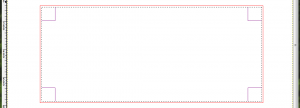
With the bounding box created, we now have a visual border we can use to determine the extent of canvas our soft box should cover. We’ll be adding a drop shadow effect to the box, too, so we’ll need to give the bounding box a little breathing room. 5 pixels on all sides is perfect for soft, small shadows. If you want larger shadows, you’ll need to provide more space between the bounding box and your selection. To do this, simply select a part of the canvas inside the bounding box and count off 5 pixels from the top, right, bottom, and left:
Now things get a little tricky. This step may depend on the version of GiMP you’re using. If you can’t find it, search the Internet. It’s in there somewhere.
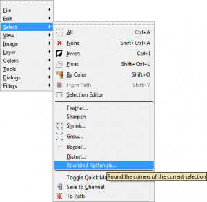
We’re going to create a rounded rectangular select for our soft box. This feature is easily accessible from Selection > Rounded Rectangle:
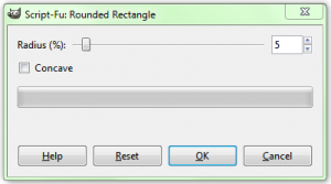
We don’t want the rounded edges to be too overbearing, so pick a nice small percentage for the radius. I like 5%:
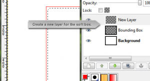
The final result should look like this. Also, now would be a really good time to create another layer for the soft box:
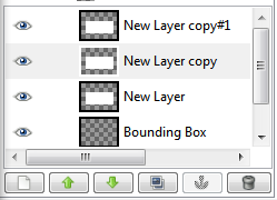
We’re well on our way to creating a nice little outline for some content! Let’s go ahead and fill this in with our background color (but first, make sure your background color is set to white!). While you’re at it, create two copies of the soft box layer. We’ll be using all three:
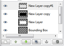
Not bad! But, before we continue, let’s set the color of each of these layers according to our specific needs. We’ll need one layer for the light gradient around the edges of our soft box (a VERY light gray), one layer for the inner color (white, in this case), and one layer for our drop shadow (black). At this point, your layers window should look roughly like the following:
It should be fairly obvious at this point that the individual layer colors can be tuned to your specific needs. If you want the base color of the soft box to be a little darker you can pick a shade of gray or beige to in place of white. The drop shadow should stay black, and the gradient layer should remain any color slightly lighter than the base color. You’ll see why soon. Keep reading.



Leave a comment