Update: May 2nd, 2012
This post remains for historical reasons, but what it was intended to fix is no longer applicable. All versions of Chrome since the latter v12 releases or early v13 releases should display smooth fonts of any size under Windows. If they don’t, you might need to adjust your OS’s font settings.
Update: June 21st, 2011
This trick no longer appears to work as of the latest Chrome release (12.0.741.100 as of this writing). In the comments below, Flix suggested using -webkit-transform instead to shift rendering to the GPU, but the effect is identical to the CSS hack listed here as far as I can tell. That is, neither works. Using a standard visible drop shadow does work, however.
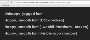
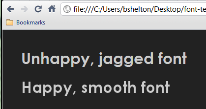
Consider the rest of this post (mostly) useless and archived. The only way to achieve the desired result is to use drop shadows with no alpha. To illustrate the examples originally included in this post in addition to the suggestion below–and for historical value?–here is a screenshot:

You will notice that there is no marked difference between the first three. Only the fourth appears to be smoothed; it is also the only one with a visible drop shadow.
Twas fun while it lasted!
Original hack as I wrote it back in March–note that this trick no longer works:
I discovered something a couple months ago that was a curio, but it wasn’t until recently that I decided to experiment with it to see if I could (ab)use it. The best part is: It’s not hard, nor does it require any scripting at all. It’s still a hack, and I’ll explain why toward the end of this post. The solution? Use text-shadow; this appears to trick Chrome’s font rendering engine into smoothing the font, but you must use the blur radius:
.smooth {
    text-shadow: 0px 0px 1px rgba(0,0,0,0);
} |
.smooth {
text-shadow: 0px 0px 1px rgba(0,0,0,0);
}
There. That’s all. Now you can enjoy (reasonably) smooth fonts across major platforms, provided your users are using Chrome. If you care to know a little bit more about how I discover this, keep reading. If reading is something you’re allergic to, you can continue on to something else.
The rest of the story
Obligatory disclaimer: I’m not much of a designer. I enjoy writing back ends more than I do UIs, but I do occasionally dabble in the world of web-facing user interfaces in addition to various UI libraries like jQuery and its myriad plugins. Sometimes, though, there is an intersection between the world of server software and user interfaces. Occasionally, I notice things that I haven’t read elsewhere; of course, this is such a rare circumstance that I tend more often than not to simply assume I’ve completely lost my mind and go about tending to other chores.
So, let’s talk about font smoothing in Chrome. If you haven’t discovered this already or haven’t read the musings of someone else who has, I’ll quickly share the basic premise. Simply put, larger font sizes look ugly in Chrome (Windows). I don’t know the technical aspects behind this, and Chromium on other platforms isn’t susceptible to the same shortcomings, but if you’ve carefully designed a site on some Unix-like OS like Mac OS X or some flavor of Linux with sub-pixel smoothing enabled, you’re going to be sorely disappointed with the fonts on Windows. While this hack doesn’t work for other browsers–Firefox 4 appears to smooth all fonts and MSIE 8 just ignores what we’re going to do–it does work exceptionally well for Google Chrome.
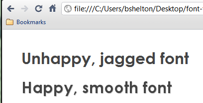
The trick? Use text-shadow. As it turns out, dropping a shadow behind a particular snippet of text forces Chrome to smooth the font. Here’s a before and after sample with a fairly standard drop shadow (text-shadow: 1px 1px 1px #ccc):

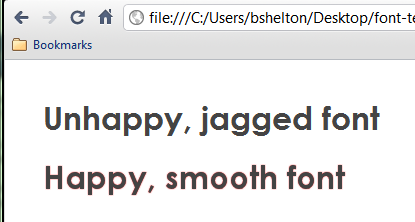
Now, obviously, it’s inappropriate to have a drop shadow on everything. Sure, you can match the drop shadow with the background color of the parent(s) containing the text, but what happens if the background contains a gradient or an image? Worst case, your text ends up with a halo; best case, it just looks a little fuzzier than normal. Here’s an illustration of the halo effect using bright red as the drop shadow (text-shadow: 0px 0px 1px #f00):

Ah, yes, you say. But you don’t need the blur radius argument!
I’m glad you suggested that. Let’s try turning it off (text-shadow: 0px 0px 0px #f00):

Whoops. Here we encounter a problem–the only way to force font smoothing in Chrome is to enable the blur radius. Without it, the fonts appear just as jagged as before. (Note: This occurs regardless of the X and Y offsets. Try it–you can move the drop shadow anywhere, and the text will still remain as it was without a shadow.)
Fortunately, there’s a trick you can use to fib the font smoothing without background bleed. In this example, I have created a CSS class as follows:
.smooth {
    text-shadow: 0px 0px 1px rgba(255,0,0,0);
} |
.smooth {
text-shadow: 0px 0px 1px rgba(255,0,0,0);
}
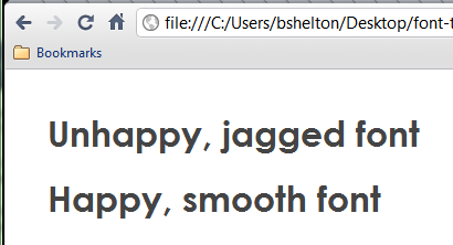
Using RGB plus alpha, we get this result with absolutely no bleed through of the drop shadow. Yes, even with bright red:

Of course, my cautious inclinations suggest to me that it’s best to match the colors to your background anyway, but for browsers that honor text-shadow, support for rgba() is included as well and as such, the text shadow will never appear.
This trick is a hack, because it appears to coerce Chrome’s font rendering engine into smoothing fonts that it would ordinarily ignore. Comparing other Webkit-based browsers on Windows (Arora and Safari, specifically) appears to suggest that Chrome uses a hybrid rendering scheme that is a cross between a built-in rendered and Windows’ default. For instance, Safari will render everything as a jagged text if the default (Windows rendering) is selected but will switch to smooth font rendering if any other mechanism is selected. Arora provides no such option, nor do many non-Webkit browsers like Opera. Obviously, you should only apply text shadows to text that you intend to use a drop-shadow on or other similar visual effect, and using this trick on small fonts (~12pt) will produce text that is almost unreadable. While there’s nothing inherently wrong with (ab)using text-shadow, you’re probably much better off using it as it was intended!
This trick does not work for any other browser on any other platform than Google Chrome for Windows. Tested with Chrome v10.0.648.151.

