Nearly every geek with a blog offered up a hasty review of Windows 7 when the beta first went public earlier this year. The exact same pattern repeated itself some months later when, on May 5, the release candidate was made available to the general public. Seriously, do a Google search for “windows 7 review” (or click the link if you’re lazy). It’s absurd. Yet a majority of these results are focused on the authors’ first impressions with Windows 7. What about using it for a few months?
I’ve been using Windows 7 off and on since about February, stopped, and picked it up again after the RC was released in May. I did go back to Windows XP for about 2 months (and Gentoo) because I honestly can’t stand onboard audio and my SoundBlaster Live! refused to work under Windows 7. You might even remember that rant. The fact is, I’ve yet to see any decent reviews of Windows 7 after even a few weeks of use. Instead, you’re likely to come across several articles highlighting the same thing. Everyone was pretty excited last year (and earlier this year) about the new task bar. Good luck finding anything else about the operating system.
But in all honesty, getting excited about something new doesn’t mean a damn thing if you haven’t actually used it in the real world. Thus, this review will cover things I like about Windows 7 that are new, a few holdovers from Windows Vista (i.e. haven’t changed much, including annoyances), and some things that are minor regressions from Vista. I won’t be making comparisons with XP much, except where necessary, although there is at least one difference worth mentioning. It’s still Windows but it’s a significant change from Windows 2000/XP to qualify in my mind as apples versus oranges. (I prefer oranges.)
The idea for this article came to me as independent suggestions from long-time WoW friend Trekk and Will, another buddy of mine who you’re probably familiar with as a regular commenter on this site. Both of these guys suggested someone should write up an article on what Windows 7 is like after a few months of use. Hopefully this will shed some light on the topic. Most of this article focuses on differences between Windows 7 and Vista, but I also try to highlight those things I find most useful.
Rather than split this review into individual pages, I have elected to put it all on one page, separated by sections. You can click through them below.
- The Blazingly Obvious Things First
- Things Improved or New in Windows 7
- Holdovers from Vista that Suck
- Show me what I clicked on before… not! (UPDATED)
- Explorer
- Bounding Boxes? Who needs ’em?
- Go Green, Go Gangrene! (NEW!)
- Holdovers from Vista that are Useful
- Regressions
- Conclusion
The Blazingly Obvious Things First
I know this revelation of mine may come as a surprise to many of you. It took a great deal of painstaking research for me to make this discovery:
Windows 7 is Windows Vista.
Really, it is.
I confess, that’s something of a slight simplification (maybe not) and does little justice to the improvements that have been made in Windows 7. Plus, I’m using only the release candidate; the RC doesn’t include such things as Windows XP compatibility mode, for instance. But, Windows 7 inherits all of the basic things that were fairly intriguing additions to Windows Vista such as Aero peek, Aero glass (the nifty theme), new subsystems, search, and so forth.
So what is Windows 7, after all?
Windows 7 is an improvement over Vista. It includes Vista’s usability enhancements but has a much more polished feel. There are still some sharp edges that are sure to be ironed out by the October release, but all things considered, Windows 7 is an improvement. I get the idea that Microsoft really did listen to customer feedback this time around and not just focus groups.
Things Improved or New in Windows 7
The Taskbar: Aero Peek
I have to jump on the taskbar bandwagon. The new taskbar is nice. When I tried the beta earlier this year, I wasn’t entirely certain whether or not it was much of an improvement. It seemed weird, maybe even awkward. I wanted to dislike it, because it was so different, but I found that it was actually really usable. Heaven forbid–it was an improvement over the static taskbar that has been in use since Windows 95.
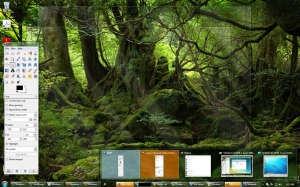
Aero peek even saw a face lift in Windows 7. Rather than simply showing previews of the window you’ve moused over, it’ll show previews of all windows in a group that can be individually highlighted to show the actual window in full size without bringing focus or input to it. First, here’s what Aero peek looks like:
It isn’t much different at all from Vista, is it? Nope, but here’s what is:
The Aero peek previews actually provide you with a full screen preview option. While this has been covered time and again in nearly every Windows 7 review I’ve read, I’ve got to confess that this is a really useful feature. Rather than cluttering my workspace with active windows, I can simply mouse over the previews and see which one contains what I’m looking for. When I come across the one that does, I click it, it restores (if it was previously minimized), and I can go about my business. This is definitely one of those features that seems entirely useless on the surface but holds a great deal of utility once you start using it.
I realize the full-sized window preview is a pretty simple feature. Maybe it’s not even all that great. Honestly, I find myself making use of it regularly, because I like to have a lot of applications option. Unlike XP (and Vista), I have little need to click through multiple windows of the same application–it just takes one mouse over and I can find precisely what I’m looking for.
To be fair, I’ve never had this particular problem with *nix. Multiple virtual desktops are handy, and I really wish Microsoft would create a decent implementation of them for Windows (MSVDM was a joke). Instead of flipping through a dozen applications all scattered across a window list, I could simply organize similar applications by desktop. The full-screen preview isn’t a bad substitute for real desktop functionality–it isn’t great–but I find it to be a feature I really like. Granted, I believe compiz-fusion has had something similar to this for about a year. (Aside: I like compiz, but the eye candy is just that. It’s pretty. It’s also pretty distracting–that’s another rant for another day!)
The Taskbar: Buttons
I like the new taskbar. Sure, I really did want a reason to disdain it (see above). Try as I might, I couldn’t. There is one caveat, however.
Unlabeled buttons suck. I don’t use Mac OS X for a reason. I don’t want to use an operating system that assumes I have to have shiny little dockable icons in order to get something done. Call me old fashioned, but I actually like labels. I don’t even use application docks under X Windows in Linux. Here’s what the same Windows 7 taskbar looks like with labels enabled:
It’s much better now, isn’t it?
While we’re on the topic of taskbar buttons, I’d also like to point out that a specific feature added to the taskbar has been an endless utility to me. It’s a stupidly simple feature, too: The ability to rearrange application icons. Oh, and the option to pin specific applications to the task bar is really nice. In fact, I think it’s better than quick launch. For that, we come to my next rant…
The Taskbar: Launching Applications
I used out of the quick launch bar. In Windows 7, the taskbar itself is now a mutant taskbar/quick launch/application dock. Here’s the cool part: Middle-clicking on an application pinned to the taskbar–regardless of whether the application has already been launched or not–launches another copy of that application.
Explorer
Explorer gets the honor of holding three distinct categories. To find out why, keep reading this section, and the next one, and the next one…
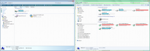
But really, Windows Explorer has seen some notable improvements since Vista. There aren’t many, but there are a handful that I find myself using from time to time. Let’s take a look at them side-by-side first (Vista’s Explorer is on the left, Windows 7’s is on the right):
A quick glance yields there’s almost no difference between the two Explorers. Both have options to open control panel, both allow you to uninstall applications, change system properties, and so forth. Windows 7’s explorer lacks icons on the utility bar as well as dividers on the explorer pane. There’s also the addition of a feature called “libraries” which allows you–more or less–to categorize all of your files and directories without actually moving their physical locations. I haven’t used this feature at all. I can think of a few uses, like organizing the years and years of pictures I’ve taken of sunsets, cats, plants, and random things that struck my fancy, but beyond that, everything else I have is categorized pretty well. If I need to find a particular song, I just use Winamp’s media library and type in a quick search (screw you, iTunes)–or Amarok’s search feature if I’m in Gentoo. But really, until NTFS supports symbolic links correctly, what’s the point of having some proprietary organizational database tucked away in Explorer when I use other OSes that can’t read it?
It was a nice try, I guess.
Now, here’s where Explorer does diverge slightly from Vista’s. Let’s look at the toolbar again after we’ve opened a directory. Here’s Vista:
It’s pretty spartan, isn’t it? If you click on a folder, it just gives you two buttons: “Organize” and “Views.” Views changes between detailed view, icons, lists, and so forth while organize lets you cut, copy, paste, set your preferences, and more.
Here’s what the same thing looks in Windows 7:
Notice that common tasks like creating a new folder have now been moved to the toolbar. Previously, in Windows Vista, there were two ways to create a new folder: the first was to right-click in the existing directory, click “new,” and click “folder” and the second was to click Organize and then “new folder.” In Windows 7, this has been reduced to one step. It’s taken me some time to train myself out of the right-click -> new -> folder steps, but it really is useful for those of us who manage tons of directories.
Windows 7 also gives you easier access to sharing (once you have sharing enabled, that is) and burning data to disc. But where’s the “views” menu? They moved it:
“Views” now live on the right hand side of the Explorer window which is a good thing. The few times I’ve used Vista, I inadvertently click the views button–not what I intended to do–and wound up with the panel switching from a detailed list (file sizes, dates, and so forth) to, say, icons. The positioning of the Views menu in Vista was pretty awful. After all, if the operating system can guess what view I want based upon the file types in whatever directory I’m browsing, I’m probably not going to change the view mode very frequently, am I?
Nope, in fact, I don’t. Windows 7 is really good at guessing what view mode I want. Most times, it sticks with details view whenever I’m doing my usual work. Whenever I’m browsing through web layouts, graphics, pictures, and the likes, Windows 7 defaults to thumbnail view (though I wish GiMP XCFs showed up!). I have used the Views menu exactly twice in the last two weeks. This is why having Views right next to Organize in a location where it can be clicked on accident was a pretty stupid design idea.
Holdovers from Vista that Suck
I have a couple of gripes for this section so bear with me. Someone has probably complained about these elsewhere. Unfortunately, and I really do apologize if I’m repeating the same old rehashed complaints from Vista, there are some things Windows 7 includes that were bad in Vista and are still bad in Windows 7. Minor? Maybe. They’re still annoying. Here’s my favorite:
Show me what I clicked on before… not!
Once upon a time in a development lab tucked deeply away within the bowels of Microsoft, there was a developer who decided it would be a good idea to let users choose whether or not the start menu showed a list of recently opened applications. (I’m lying, it was probably a design team.) There was much rejoicing and it went something like this:
Fast forward to around 2006 and you’ve got these choices:
Which, by way of something other than Darwinian natural selection, later evolved into these with Windows 7:
Since I’d like to consider myself a slightly-smarter-than-average-user, I actually know what applications I use on a regular basis and have no need for the operating system to tell me what I use most frequently. After all, what defines “frequent?” Is a frequently-used application something I’ve clicked on two dozen times because it’s unstable and crashes every single time I load the stupid thing? Is a frequently-used application something I click on once at the start of the day, leave running for days on end and close periodically? Near as I can tell, Windows doesn’t differentiate between these use cases, and that is precisely why I find the entire idea of OS-assisted “frequently used” application lists to be a pointless waste of time.
Only the user truly knows what he or she uses most.
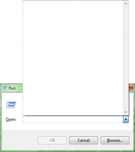
So, I disabled this particular feature–until I discovered that it is linked to something I do use a history-of-previously-launched-applications for:
As it turns out, this is a brilliantly stupid hold over from Windows Vista. In XP, if you set the maximum previously-launched programs to display in the start menu to exactly zero, it’d still record a history, but the run menu would still show you everything you manually typed in and launched. And–here’s the important part–the start menu wouldn’t be cluttered with useless, random cruft launched during a sleepy stupor-induced clickfest brought on by insomnia. Or muscle spasms of the click finger. Take your pick.
As yet, I have no idea of any work-arounds. If there’s one for Vista, it should work in Windows 7. I’d be happy to reprint or link to any tips or hints, if you know of a way around this issue.
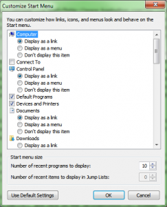
Update: July 30. I found out the option for limiting the number of recently opened applications in Vista and 7 is very similar to XP it’s just a little hidden. If you follow the instructions here, it will work as expected.
First, right-click on your start menu, click on properties, select the Start Menu tab, and click on the customize button. You’ll see something like this:
Simply change the “number of recent programs to display” to zero, and it’ll behave exactly as it did under Windows XP.
Explorer
Yeah, I’m sorry. Explorer sucks. I really preferred the UI for Windows explorer in Windows XP and prior. I mean, take a look at this:
Those icons just hurt my eyes. While I admire Vista’s original attempts to increase the base resolution of icons by enforcing greater dimensions, they do not scale down well. The higher contrast icons of Windows XP and earlier just look better. Maybe I’m just used to them.
Bounding Boxes? Who needs ’em?
I’m on a little rant about explorer, so I may as well talk about something that has yet to be fixed in Windows 7. I’m not so sure it’s a bug, but the user interface is incredibly misleading in this particular case. Let’s take a look at a directory containing numerous images of relatively short (as in pixel height) stature.
Clicking on an image yields bounding boxes of equal size:
Visually, this offers a clue that clicking anywhere inside the blue square will allow you to manipulate the file. This also offers a hint that clicking and dragging will work as expected: simply click anywhere in the box and drag, right?
Not so fast. Click-and-drag works only if the file has already been selected. In other words, when the little box has been drawn, it’s safe to click and drag. However, if you’ve had another file selected or have recently opened a directory containing images, clicking and dragging yields an unexpected result given the bounding box’s size:
As you can see above, rather than grabbing onto the bounding box, click-and-drag results in a select operation.
But, here’s something even more annoying:
Conduct the exact same steps with larger (taller) images, and the click-and-drag operation behaves as expected regardless of whatever file or directory previously held focus. Depending on the preview size, this behavior isn’t always consistent, either. If you’re expecting to click-and-drag to select several pictures but all pictures are all of maximum height, and you’ll discover that the multiple selection box suddenly doesn’t work and you’re dragging pictures around individually! The trick, it seems, is to aim the mouse pointer in an empty part of the bounding box, unfocused, if you wish to draw a multiple selection box. Unfortunately, since not all pictures are equal–or even of the same size–doing this quickly and without some precision is difficult and the behavior is unintuitive. This could be made easier if it were possible to increase the “gutter” between pictures but that isn’t my chief complaint. Imagine the difficulty an elderly person with less than perfect motor skills might have when trying to drag-and-drop an image. Imagine a person with degenerative nerve disease, imagine someone who’s never used a mouse before–the list goes on!
Go Green, Go Gangrene!
“Power management” is a term that is, in the realm of traditional desktop PCs, ironic in a sense similar to free elections in a dictatorship. It makes the outside observer feel good that the Right Thing is being done. In the grand scheme of things, power management means very little in terms of overall savings. After all, the cost of replacing a hard drive (~$59 for a 500GiB drive at Newegg plus whatever labor is required if you’re not installing it yourself) is probably a lot higher than the 1,000 watts you’ve saved over the course of some three months your computer has been entering a power save state.
Pro-tip: If you’re concerned about power usage, turn the computer off when you’re not using it. You’re also more likely to have greater net power savings by letting power management turn your monitor off than letting it manage your hard disks. Remember, disks have motors, and those motors consume more power during spin-up than they do at speed and idle. In other words, frequent hard disk spin-ups every hour or two with about 20 minutes in between of alternating use and power-off states will probably net the same or greater power consumption as leaving those same drives idle.
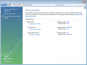
Now, you’re probably wondering why I placed this in the category of “Holdovers from Vista that suck.” Don’t worry, I’m getting there! But first, let’s take a look at the power saving settings from Vista. I captured all of the following shots (including the Windows 7 ones) from my virtual machines so I could demonstrate side-by-side each OS’ default settings. Here’s the power profiles in Vista:
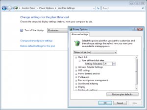
If we open up the advanced settings on the default “balanced” profile, we get a display that looks like this:
So far so good.
Want to wager what the power management settings are in Windows 7? How about the profiles?
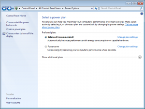
Well, if I told you that the number of default profiles weren’t as numerous, but it was otherwise much like Vista, would you believe me? Of course you would! And you’ve got good reason to with all the things that are more or less the same between Vista and Seven. Here’s the Windows 7 profiles:
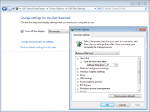
And the moment of truth–the advanced power management settings in Windows 7:
As you can see, both operating systems set your hard disks to turn off after only 20 minutes of inactivity. That’s unacceptable. Unless you’re marketing the operating system as a “green,” OS (and they are), there’s no need for such draconian power down settings as Grimblast mentions below.
So far, I haven’t been able to stop Windows 7 from turning off my Thermaltake Max 4 external enclosure. I think it might be the chipset Thermaltake uses but it’s nothing Python can’t fix:
1 2 3 4 5 | import time while True fp = open("H:\\nosleep", "w") fp.close() time.sleep(60) |
I have made a change to the “USB selective suspend” setting in Windows 7’s power management and will report back here if it resolves the problem. Turning off sleep states on the USB root device in XP appeared to work.
Holdovers from Vista that are Useful
Explorer
I’m listing explorer again because it’s not that bad in Windows 7. It’s actually pretty usable–more so than it was under Vista. I won’t go into detail in this section about the improvements, but I will cover the things that did make explorer useful–even in Vista.
First, the address bar:
How awesome is that? You can actually choose to copy out the URL. “But wait,” you say, “every version of Windows Explorer lets you do exactly that. It’s not revolutionary!”
Yeah it is, and here’s why I find it useful after all this time of using Windows 7: I turn that damned address bar off in Windows XP because it is a waste of valuable screen real estate. As soon as I reinstall–*click*–goodbye address bar. It’s awful and there’s no excuse for it to take up the room it does. In Windows Vista onwards, the address bar in explorer is more sensibly integrated into the UI. They also copied an idea from Gnome (probably the only useful idea in Gnome), too:
Breadcrumbs are pretty fancy things. At least the implementation in Vista onwards doesn’t flat-out suck like it does in Gnome.
UAC
I could put this in the suck section, but let’s be fair.
UAC has gotten a bad rap. Some of it’s justified, believe me! Really, though, it’s one of those features that is an awful, annoying mess–yet it presents some utility for less savvy users. (Really, it does; I’ll explain why in a moment.) The more I’ve used it, the more I’ve gotten used to it, and the more I find it isn’t really all that bad. Plus, it isn’t as invasive in Windows 7, and it actually works better than Ubuntus pseudo-sudo X11 prompter.
Before I start praising UAC, the best argument I have heard in favor of it is point #12 in this article, “12 ideas Ubuntu should steal from Windows.” Here’s a graphical summary of what the author is getting at:
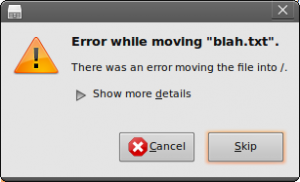
Let’s assume that for some misguided reason or another, Mr. Average User running Ubuntu at the behest of a savvy friend decides to copy a text file to /. Obviously, if he’s entirely clueless, he won’t know anything about sudo or kin. Thus, he’ll wind up with this warning.
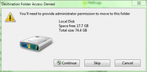
Now, if he were using Windows Vista or Windows 7, he’d be prompted with this instead if he attempts to copy something to a directory he doesn’t own:
Before you Linux zealots start off with calling me a mindless ninny and Microsoft shill, let me point out a couple of things:
- I’ve run Unix-like OSes in a server environment since 2001 starting with OpenBSD and FreeBSD.
- My home file server runs Gentoo Linux and has since 2004.
- I used Gentoo Linux as my sole desktop OS from early 2007 for about a year and a half until August or September 2008.
- I’m an open source fanatic.
- I also like to be fair in my reviews; I’m no fan of MS, but I really think they’ve done a respectable job with Win 7.
So here’s the deal: Mr. Average User could do something akin to sudo cp ~/Desktop/blah.txt / if he wanted to. Here’s the catch: he doesn’t know what sudo is. Let’s forget for a moment why he’d want to copy something to his root directory; it could just as well be any other root-owned directory like /usr/lib/python2.5/site-packages, and he could very well be copying something that a friend of his implored him to! Under Windows 7 and Vista, UAC offers some assistance for barely-savvy users (ones who know enough about explorer and what it does) to manipulate their file system without having full time administrative access.
I hated UAC initially. I still find it a nuisance when I’m copying dozens of things into directories I don’t own and have since forgotten to correct the permissions on. Yet UAC does provide a useful tool even if it was shoehorned into place inconveniently.
The Copy Dialog
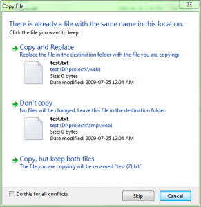
I have to admit, this is cool. It isn’t original by any stretch of the imagination (KDE provided this feature a very long time ago in 3.x–maybe earlier–screenshot forthcoming). But seriously, this is a feature Microsoft should have borrowed a long time ago. Introduced in Windows Vista, the updated copy/replace dialog could have been backported to XP in one of the various service packs–it’s just that much better:
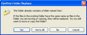
In XP and earlier, there was the familiar “Yes/yes to all/no/cancel” dialog that never exactly worked as expected:
Click “Yes to all,” and you’ll copy over everything as expected–until you hit a system file or a read only file. Then you have to click “Yes to all” again. And again.
The updated dialog originally presented in Vista offers you a slightly different set of choices. You can choose to overwrite everything one file at a time, or you can check the checkbox at the bottom of the window to “Do this for all $num conflicts.” Better yet, you can also elect to keep both files by renaming the version you’re copying in.
Though, as I mentioned, this is something that was introduced in at least KDE 3.x during XP’s reign.
Regressions
Regressions are those annoying little things that make worthwhile upgrades seem a little less appealing. Don’t worry, Windows 7 has at least one that I’ve encountered. It isn’t serious, but it’s really annoying when you’re looking for something specific.
Advanced Appearance Sett… wait, what?
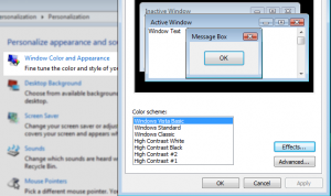
In Windows XP, accessing the advanced appearance settings–even the advanced ones if you wanted–as stupid easy: right-click on the desktop then click on “properties.” You know which ones I mean. Sometimes you might want to change a font for something, or a background color. It was pretty easy, because you’d only have to click on the “appearance” tab.
Starting with Windows Vista, accessing the display settings became slightly more obnoxious. First, there is no “properties” from the desktop anymore. The closest thing to “properties” these days is “personalize” (hey, it’s still a “P” word, right?). Then you have to click on “Window color and appearance” like this:
That’s not too bad. At least it’s categorized somewhere easy to find, right?
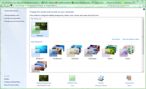
Wait until you see what Windows 7 does here. The first step is identical to Vista: right-click on the desktop, then click on “personalize.” The next step is to remain confused for at least 15 minutes unless you’re like me and you have some Indian Jones-like sense of adventure. Just watch for traps. Here are all the steps, and I really wish I was kidding. They aren’t hard, but they’re also not very obvious. Well, I take that back–but more on that in a moment.
First, let’s look at the personalization menu:
Oh boy, where would I go from here? Well, if we’re trying to change the window coloring, we’d probably click on “window color.” Makes sense, right? But what if you wanted to change the font on your title bar?
You’d click “window color.” Yes, that’s right–to change a font–you have to go to the menu that lets you change the window coloring.
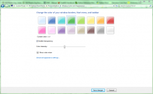
Next, from the window color dialog, we have some choices:
Well, if we wanted to change the colors, this looks like the place. There’s a catch, though: it only affects the color of aero glass. See how the border of my windows are a soothing green color in all my screenshots? That’s because I adjusted the color here. Insofar as foreground colors of my windows are concerned (you know, that windows “gray” color that every dialog has), I can’t manipulate those colors here.
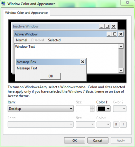
So that must mean I’d go to “Advanced appearance settings…” right? Yep.
I do believe this means I won a cookie. So, to change the font of my title bars, I must first right-click on the desktop, click “personalize,” click on “window color,” then click on “Advanced appearance settings…,” and then I’m home free.
Don’t worry, it’s easier if you have Aero disabled. You don’t have to follow that “Advanced appearance settings…” step. To change the font, you simply click on “window color.” I guess that makes sense…
To play devil’s advocate, it kind of does. Since Microsoft went out of their way to categorize things a little bit better, they’ve decided that certain things need to be placed in specific locations even–I’m guessing–if those locations make absolutely no sense whatsoever. How window fonts can be changed by editing the “window color” is beyond me, but I’m sure it made some sense to the team that conducted focus group studies, user studies, in-house studies, and a measurement of ocean currents for good measure.
Okay, I confess. I’m grasping. I can’t think of any decent way to excuse this particular choice. It took me about 5 minutes of mindless clicking to locate that menu. One, because I never really have a need to change fonts. Two, because it made more sense that it’d be located under “display” from the lower left hand corner of the personalization window. Three, display is misleading and actually controls the display you have connected to the computer. (I’m going to be putting Captain Obvious out of a job here soon.)
Conclusion
Is Windows 7 all that different from Vista? No, it’s not. There are some notable improvements in Windows 7, many of which I’ve listed here, but it isn’t a drastic change from Vista. Windows 7 is essentially Windows Vista SP3, plus enhancements. Don’t be deluded by Microsoft fanatics into thinking it’s anything else.
That said, many features introduced with Vista weren’t nearly as bad as some anti-Microsoft bloggers have claimed. UAC is annoying, but with the direction most OSes are moving, it isn’t terrible. The changes to Windows Explorer were something of a disappointment. Fortunately, most of the shortcomings and annoyances introduced with the changes presented by Vista have been mitigated or marginalized by Windows 7’s slight adjustments.
I skipped Vista largely because of the roll out problems Microsoft faced. Things like limited hardware support for existing devices really seemed problematic, for example. At the time, I was still using a couple of legacy devices like a Promise-based ATA-133 card that didn’t even work in XP x64 (it wasn’t that old, either!). My SoundBlaster Live! was also something of a problem; compounding that with my networked printer set up via CUPS, any move to Vista seemed suicidal. I would’ve migrated eventually (especially now), but I tend to be more conservative in my purchases and upgrades. I’m not an early adopter. I want hardware that works with a proven track record. Otherwise, I’ll be holding back for a little while. I guess that’s my sysadmin streak shining through–stability is more important than bleeding edge.
Regardless, Windows 7 (Vista II?) is worth the money, although you need at least a dual core system to notice some of the changes. For my purposes, the library, the updated version of Windows Media Player, and ease of access for wireless networks are useless features. They’re great for some people, I’m sure, but not for me. I categorize my files according to type (and other criteria), I use Winamp instead of WMP, and I have a wired network. For me, the UI improvements are the most useful. I imagine I would have enjoyed them had I migrated to Vista in 2006, too. Regardless, Windows 7 holds improvements even over Vista, and I think that’s a good thing. Microsoft may have copied ideas from other sources (KDE, Gnome, OS X), but that is a good thing. Usability improvements for Windows users should be considered a win for us all.
If you have a dual core system with about 2GiB of RAM or more and you’re running Windows XP or Windows Vista, you should consider upgrading to Windows 7. If you have less than 2GiB RAM or are happy with XP, stay where you are. That’s the usual advice most experts share with consumers uncertain about what choice is best for them. We can’t make the decision for you, but if you’re itching for an OS upgrade, now would be the time.











2 Responses to “Using Windows 7 RC, Months Later”
If only I had the time to comment on Vista…er…Windows 7 like this. I’ve yet to have it bomb like vista has on me in the past. I haven’t had any hardware issues with it just yet but occasionally I see something quirky such as alt tabbing from a game and the transparencies on windows and the taskbar stop working. Nothing too major has gotten in my way since I have terminated a few of those apps you pointed out in a post sometime back.
Microsoft still needs to work on their default power settings in Windows 7 though. They are annoying as hell if you don’t adjust them straight out of the install.
To be honest, this entire rant–as it were–was written across the span of about three evenings. There was a bit of research I had to conduct (against Vista, mostly, since I’ve never really used it for more than a few minutes in a VM) and screen shots that had to be taken, so the actual time spent writing was likely only two hours or so. Screen shots tend to slow me down.
Now, I haven’t noticed the taskbar issues during the course of my regular use. Frankly, I’ve had fewer issues in Windows 7 than I have in XP as of late. Even with about 12-16 sessions of Windows Explorer running, 7 seems much more stable; try the same thing in XP, and Explorer (including the taskbar) will crash. So, for use cases related to 1) software development, 2) web development, and 3) general “office” style tasks, Windows 7 is really much better than Windows XP. I’m not so sure for games, because I’ve only played them a few times under 7 and had limited luck (mostly due to my SB Live!).
I do agree about the power management features. They’re a little too aggressive, but thankfully that’s fairly easy to correct. It’s worth noting that the default power management settings in Windows 7 are identical to those in Windows Vista. I’ll add this to my article along with some additional screen shots.
Leave a comment