I can see clearly now, the–duplicates?!
Yep, we’re going to duplicate one more layer. Remember waaaay back on the second page how all of this mess was really just done from a duplicate of that first base image? You did duplicate it, didn’t you? Good! We’re going to use that now. I told you it was important, didn’t I?
First, duplicate the original layer. It should be named exactly as the text is written without any additional #
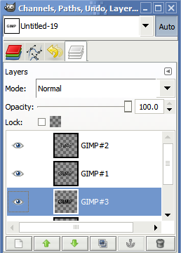
And the image will look a little strange. In fact, it should look something like this:

We’re going to doctor this layer up a little so we can blur it a little. Unfortunately, if we were to apply Gaussian blur as it is right now, the edges of the layer would cut the blur off sharply–and that doesn’t look good. To remedy this situation, let’s create a new layer:
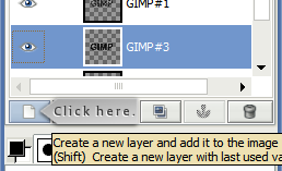
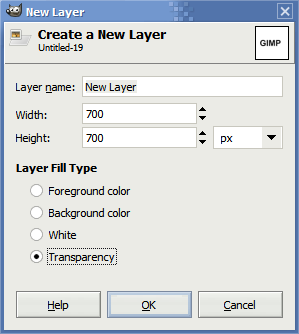
And create it as a transparent layer:
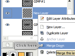
Next, right-click the new layer (it’s also conveniently called New Layer, too!) and click Merge Down:
Then we’re going to select only the contents of this layer. To do this, right-click the layer we’ve just merged, and click on Alpha to Selection. You should wind up with a marquee around your text that looks just like this:

Next, we’re going to right-click on the canvas and go to Select > Grow… and set the selection growth to something like this:
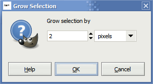
Click OK and then right-click on the canvas and go to Edit > Fill with FG Color (or BG Color–whichever is black). This should fill the entire selection with black. Next, we’re going to need to remove this selection before we blur it, so right-click on the canvas and go to Select > None.
Finally, to get the blur we want, right-click on the canvas again and go to Filters > Blur > Gaussian Blur. You’ll want to have an X and Y blur of around 7 or something like this:
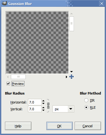
Once you click OK your image should now look like this:

We’re getting there! Hang in for just one more page!


2 Responses to “Scratched/Worn Text Tutorial in the GIMP”
Wow that’s a lot of screenshots!
Thanks for the step-by-step, Ben! That tutorial makes for a very cool text effect!
Yeah, I think I went a little overboard. All told I think I finished with 56 screenshots of the actual work. Thankfully, I was able to trim it down significantly.
Leave a comment