A Few (Dozen) Finishing Touches
We’re going to wear out a lot more of the text at this point to give it a few water spots. If you’re satisfied with your work so far, skip these steps and go to the next page. If you’re interested in antiquing it a little more, keep reading.
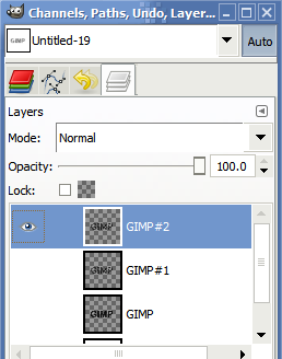
Before we go much further, we’ll want to create a backup of the work we’ve accomplished so far. Besides saving another copy of the file, let’s also duplicate the current layer. Right-click in the “Channels, Paths, etc.,” dialog, click on Duplicate Layer, and you should have something like this:

There should be three layers: Our first one where we faded the text a little, the scratched lettering (which we’ve hidden), and the current layer that we’re going to cut a few more pieces out of.
To recap the steps from earlier where we used the Solid Noise plugin to generate some transparency in our base image:
- You’ll Add Layer Mask on the current layer by right-clicking it in the Layers dialog
- Right-click on the canvas and go to Filters > Render > Clouds > Solid Noise
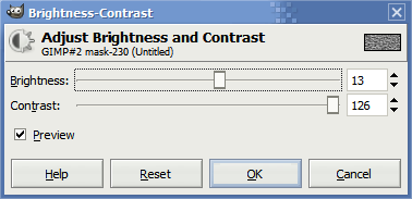
- And then adjust the brightness and contrast by right-clicking the canvas and going to Colors > Brightness and Contrast
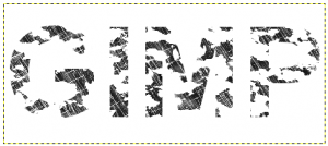
This part is important for a good bunch of wear and tear. Cut out a lot of the base text so it looks something like this:

I used these settings:

At this point, if you unhide the original layer we scratched up and alter its transparency, you’ll have something that looks like this:

Notice how various parts of it appear a little lighter in color than others? Those are the parts we cut out in the previous steps.
I’m going to cut this page a little short because these are the watermark/extra fading steps needed for getting the base image we were working with. If you were satisfied with the scratched base image, you should be skipping passed this point! Otherwise, whether you’re following these steps to the letter or skipping ahead, keep reading–this next part applies to both!


2 Responses to “Scratched/Worn Text Tutorial in the GIMP”
Wow that’s a lot of screenshots!
Thanks for the step-by-step, Ben! That tutorial makes for a very cool text effect!
Yeah, I think I went a little overboard. All told I think I finished with 56 screenshots of the actual work. Thankfully, I was able to trim it down significantly.
Leave a comment