Because Swiss Cheese is Good Cheese
Personally, I like Swiss cheese. A good one is slightly sweet to the tongue but possesses a slight bite–nay, zing–that makes you crave more. And make no mistake about it, Swiss cheese has absolutely nothing to do with this tutorial. Well, except for the holes.
Now where was I?
Oh yes! The holes. We really like holes for this particular project, so guess what we’re going to do? We’re going to add more. Follow the previous steps of:
- Creating a new layer mask (make sure you applied the previous one)
- Re-running the Solid Noise filter
- Changing the contrast/brightness of the layer mask to create a few relatively small holes
After a second iteration, you should wind up with something that looks a little like this:

Here comes the fun part. We’re going to scratch the living daylights out of the text we created. But first, you did Apply Layer Mask to the previous changes, didn’t you?
Good.
Let’s start with adding some regular “noise” to the layer. First, right-click the layer we’ve been working on and then click Add Layer Mask. Now, right-click anywhere on the canvas and go to: Filters > Noise > RGB Noise. Take the slider and drag it all the way to the right. You should get something that looks like this:
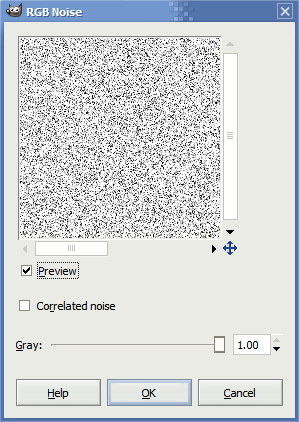
Your text will start to look like it has a zillion little microscopic holes in it. It’s kinda like Swiss cheese that’s really been shrunk down. Or maybe peppered with a load of white peppercorns.
Mmmmmm.
I’m not satisfied with just a few white peppercorns all over our Swiss, are you? Hit ctrl+f about two or three times until you get a slightly fuzzy image like this one:

You’re probably wondering how we’re going to take this and turn it into a scratched image. I’m glad you asked. This next part is pretty easy. First, right-click anywhere on the canvas and go to Filters > Blur > Motion Blur and adjust your motion blur properties until they look something like this:
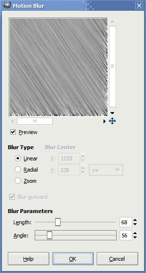
If you’re feeling particularly adventuresome, you can alter the Angle of the motion blur to something else but try keeping the length set to about 40-70. Anything less and it’ll start to take a bit of a metallic look to it (although that might be what you’re aiming for!). Now, click OK. You should wind up with something that looks vaguely like this:

You’ll be surprised how we’re going to turn this into a bunch of parallel scratch marks–or maybe not. Remember how we made the holes? We’re going to follow the same steps again, except with some slight modifications.
Right-click anywhere on the canvas then go to Colors > Brightness and Contrast and adjust your settings so they’re close to this (you might need to adjust the contrast higher):
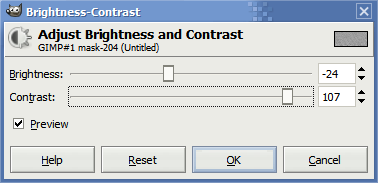
First, here’s a couple of hints. Low contrast values will make the edges of the scratches appear fuzzy. This is great for the first “lower” layer of scratches since they’re probably well-abraded and have almost vanished into the edges of other blemishes. However, for “newer” top-level scratches, this is a no-go. You’ll probably want to have contrast levels between 123 and 126. Don’t go much higher, otherwise the edges pixellize and start to look pretty artificial.
You’ll want to follow these steps again another two or three times:
- Right-click on the canvas and go to Filters > Noise > RGB Noise
- Press ctrl+f about 2-4 times to re-run the noise filter
- Right-click on the canvas again and go to Filters > Blur > Motion Blur
- Important: Make sure to change the angle of the motion blur each time. I usually vary it from greater than 90 degrees to much less than 90 degrees
- Right-click on the canvas and go to Colors > Brightness and Contrast and adjust it until the scratches appear to your liking; the lower the brightness, the more obvious, deeper, and numerous the scratches
- Repeat
When you’re finished, you should wind up with an image that looks pretty close to this:

Now we’re talking.


2 Responses to “Scratched/Worn Text Tutorial in the GIMP”
Wow that’s a lot of screenshots!
Thanks for the step-by-step, Ben! That tutorial makes for a very cool text effect!
Yeah, I think I went a little overboard. All told I think I finished with 56 screenshots of the actual work. Thankfully, I was able to trim it down significantly.
Leave a comment