Annoyances: Video Tutorials

I’ve ranted about this before in another post, but it’s so damnably obnoxious that I can’t contain myself.

Before I start, I want to address the disagreement some of you are bound to have–yes, yes, I know that video tutorials have their place. For example, they might be exceedingly helpful for individuals whose tech level is below such threshold that they have a difficult time understanding the difference between left and right click. Or perhaps it’s a topic that requires some visual guidance such as conceptual demonstrations for Blender, Photoshop, or various other things that are highly interactive and not easily explained. (I still appeal that a skilled writer can explain anything with the written word that a video tutorial can–it’s just that some things are easier to convey visually.)

That, of course, is not the point of this post. The point is that there is a right way to illustrate simple concepts such as a single configuration change in an OS, and there are many more wrong ways to do the same thing.

Here’s an example. I haven’t (until recently) been using Ubuntu much, mostly because I’m in the process of abandoning Gentoo. Thus, I couldn’t remember specifically how to move the window interaction widgets (close, minimize, and maximize) to the right. I immediately stumbled across numerous sites that had embedded Youtube videos like this one.

I promptly closed them.

Video tutorials are a time sink. Generally, the viewer will have wasted at least one minute listening to someone introduce themselves, why they’re important, and then rant about whatever solution they’re going to demonstrate. Then, when the star of the show finally gets to the meat of a discussion that should take less than 15 seconds to explain, they invariably drone on and on about what items to click on, where to enter the change, and we get to stumble over each typo with our hapless host for 20 painful seconds. Once we’re finally presented with useful information, our brains have collectively rotted so severely that we have no recollection of what we were initially researching or attempting to resolve. This is the wrong way to share information. Worse, if one were to add up the total time consumed by video tutorials, minus the 5 seconds of useful information, there are hundreds of hours being wasted every day. It may not be Farmville, but it is close.

Side note: I’m not picking on the video I linked to above–I actually haven’t watched it–but I did see one earlier today where it took the individual recording it about 5 attempts to type gconf-editor correctly.

How then is the right way to do this? Easy. Howtogeek typically does things the right way in a manner that is insanely easy to follow, and you’d have to be comatose to have any difficulty with their tutorials. There are many more examples of how to illustrate a very simple concept quickly and efficiently, both in terms of time and bandwidth.

In other words, a good rule of thumb to follow is that if you can explain the concept in less than a paragraph, a video tutorial is like nuking your house from orbit because you’re too inept to fumble around for a slipper to kill that pesky house spider. That there are video tutorials on how to boil water worries me. Has our society grown so collectively dependent on instant gratification that we can’t so much as spend the time to read something?

Hint: It almost always takes longer to sit and watch an instructional video than it otherwise would to read those same instructions. Ever wonder why those cabinet kits you buy at the store have a piece of folded paper stuffed inside the hardware bag instead of a DVD? Paper is cheaper, for one, and for two, the average consumer is free to stare at the diagram (usually poorly written) for as long as they like; with an equally poorly recorded instructional video, I can only imagine that same consumer replaying the same 5 second segment two or three dozen times trying to figure out that the wooden dowel does, in fact, go inside the hole.

Let me reiterate my pet peeve about frivolous video tutorials:

Stop.

This.

Insanity.

Right.

Now.

Your unnecessary video tutorials are wasting bandwidth, and for most people looking for a quick solution (or reminder), a video tutorial is simply going to waste their time. Certainly, video tutorials are handy for individuals who may not know where to click on something, but I don’t see how it’s any faster than making a single post with a handful of easy to follow written instructions. Click here, click here, type this, press enter, look for item X, change it to Y, click close, done. See? Easy.

For those of you who link to every single obnoxious video tutorial on Youtube for all of your woes, please stop. Find something more meaningful like a textual post. It might surprise you to discover that some of us know how to read.

Video rots the brain, and get off my lawn.

Update: I decided to do some research, and while it doesn’t specifically address video tutorials, I think that usability expert Jakob Nielsen has an article worth reading that targets video on the web. It’s not the same thing, but I do feel that it applies tangentially to this topic.

No comments.
***

Annoyances: Windows 7 DVD/CD Tray Ejection

I discovered earlier this week that Windows 7 has another annoying holdover from Windows Vista. It turns out that if you have CD or DVD burner, Windows will conveniently eject the tray for you if you double-click the drive from Windows Explorer (or single click it from the file save/open dialog).

That’s a great idea EXCEPT when you have a case like this one. (Mine’s an older Sonata but the same situation applies.) Let’s think about it: Ejecting the tray when there’s a lid outside the drive that operates to keep it closed. Thank goodness I didn’t damage anything.

Thankfully, there’s a solution. It’s not a great solution. They don’t have an obvious “uncheck this to prevent Windows from stupidly ejecting your drive during accidental clicks.” Instead, you have to disable and remove burning features from Windows explorer using the group policy editor (gpedit.msc).

TLDR version/I don’t like clicking links:

To disable ejecting your CD tray after an accidental click, enter gpedit.msc into the run menu or the start menu’s search bar and then browse to: User Configuration -> Administrative Templates -> Windows Components -> and click on Windows Explorer. From here, set Remove CD Burning Features to Enabled.

3 comments.
***

Quickie: Open Source Annoyances

As many of you know I’m a strong promoter of open source. I use a lot of F/OSS (Free/Open Source Software) applications and quite a few commercial ones. In many cases, I have found the the F/OSS apps are useful precisely because they don’t get in the way (OpenOffice.org versus Microsoft Office is a great example where the commercial application is a greater nuisance).

However, I have my share of gripes. I plan on writing a lengthy essay on one such complaint of mine, but that’s reserved for the future! This one is a lot more simple. Here:

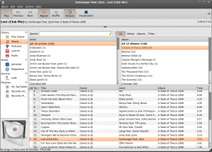
Rhythmbox Screenshot

Meet Rhythmbox. It ships with Ubuntu (and Ubuntu variants like Linux Mint) as the default media player.

It’s a damn nuisance! It’s uselessness rivals that of Windows Media Player. Though, I think that’s an unfair comparison. WMP ships with useful codecs and is fairly capable in its own right.

Aside from the obvious issue of duplication effort–and there are a lot of free media players on the market these days–it’s increasingly obvious to me that some developers focus more on simplicity and less on usability. Here’s a short use case that they evidently didn’t plan for and it’s really simple. I like to listen to specific songs repeatedly. In fact, I’ll listen to exactly the same song over and over and over and over again until the neighbors lose their mind. If I like a song, I am going to put it on repeat and listen to it over and over again.

You can’t do this in Rhythmbox unless you use the search or artist features to limit the song displayed to one single track. I’m sure the developers would probably suggest that this is intentional–my use case has already been considered–and that the best way is to make sure my current play list shows only one song. I can work with that but it’s inconvenient. If I want to change songs, I have to use the search feature again which completely eliminates the point of having a playlist, album list, or artist list. I kind of like to browse through my list of songs before selecting one to place on repeat, and resorting to a search feature to repeat one track alone is a bit stupid.

Oh, and there’s a HUGE gap between the end of one track and the beginning of another. This occurs even if you have one song on your playlist. The last time I had such a huge gap in playback was when MP3s were first becoming popular and I had an early Pentium clocked at a whopping 200 MHz.

I’m glad I have Amarok to compete against nonsense like this.

Anyway, this rant has a reason. Open source developers often say one of two things: “It works exactly as intended and we have no reason to supply additional functionality” or the dismissive “I write this for my own enjoyment and if you don’t like it, tough!” In the former case, I’m glad there’s competition, and this is precisely why duplication of effort isn’t necessarily a bad thing: The more projects that provide the same service, the more potential competitors there are who are each likely to provide functionality a specific subset of people want. In the case of the latter, if a developer writes the software exclusively for himself and not for the hopes that someone else might make use of it (Pidgin developers, I’m lookin’ at you), that developer has no business encouraging their software to be included in a major public distro like Ubuntu. No, really.

I don’t want to get ahead of myself, though. This rant is one that’s been bugging me for a while now. I’ll have to write it up this weekend!

I think I went a little longer than I expected. If you have corrections or suggestions to make, post them and I’ll make good on any mistakes I’ve made. However, you won’t change my mind: Rhythmbox sucks. I suspect that there are only three types of people who use it: The Rhythmbox developers, poor SOBs who don’t know any better, and people who have extremely limited needs. I suspect the latter group could be mixed in with either of the former.

No comments.
***