Pages: 1 2
I’ve got the Blues
Now that you’ve gotten a blob of colors wound up in the shape of a recursive fractal (that’s what they tell me, anyway), you’re probably suspecting we’re going to do something to it. We are, and it doesn’t involve motion blur. I know someone out there was probably thinking something along those lines!
But first, we need to make sure the colors match what we want. I’m not particularly fond of brown and yellow, so let’s add some blue. To change the hue of our flame, make sure you have the flame layer selected in your “Channels, Paths, etc” window then right click on the canvas and go to Colors -> Hue Saturation:
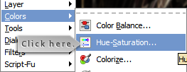
Figure 11: Hue/Saturation menu.
This should open the hue/saturation dialog. From here, change the Hue slider until the flame appears blue (around a value of 144) and click OK:
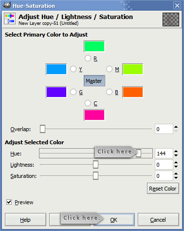
Figure 12: Change the hue of your flame until it appears blue. You can move the “saturation” slider if you want to add more or less color.
Obviously, you can choose any color you prefer. For the sake of this tutorial, we’ll be picking blue. Why blue? Because blue is groovy. That’s why.
Now that our flame is feeling a little blue, we need to move it toward the top of our canvas so we have some room to do our scaling. To move the layer, click on the move layer button:

Figure 13: Move Layer.
And move the flame layer up so it looks something like this:
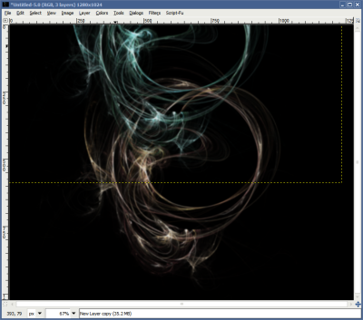
Figure 14: Your layer should be moved such that the brighter parts are close to the top of the canvas.
Don’t worry if it doesn’t move exactly right the first time. If you find the background layer (the one that’s black) moving around instead, you may just need to select the correct layer from the Channels, Layers, Paths… window. Remember: If at first you don’t succeed, try and try again!
It’s Always Nice to Stretch
Stretching feels good, doesn’t it? After a few hours of sitting in front of a screen and writing code (or tutorials!), it’s always good to stand up and streeeeeeeeeeeeetch those muscles with a good yawn.
I’ll bet you’re yawning right now, aren’t you? Told you so!
Stretching is also a great way to get things that normally don’t look like much to suddenly look amazing. First off, we need to select a region to stretch. So, we’ll click our rectangular selection tool:

Figure 15: Select the rectangular selection (marquee) tool.
And then we’ll draw a selection around one of the brighter parts of our flame:

Figure 16: Draw a small rectangle around the brightest part of the flame layer. You’ll want it to be about 5 to 10 pixels high. Don’t make it too big or too small!
Again, it doesn’t have to be perfect, but make sure you have a fairly thin selection. 5 to 10 pixels in height works great, but make sure you select the brighter part of the flame! If you don’t, the light curtains may appear less than stunning.
And now, we stretch. Don’t worry, it’s easy! Just click on the scale tool (if you can’t find it, just let the mouse hover over individual buttons until you do):

Figure 17: Select the “scale” tool to scale the layer.
Then click once on the selection we made in step 16 until a few little boxes appear around the selection’s borders, and drag them down. You should wind up with something like this:
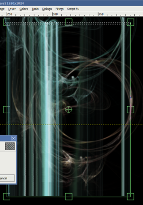
Figure 18: Click ONCE on the layer you used the rectangular select tool on until a few boxes appear then DRAG the layer down so it looks something like this image.
This part is important, so listen closely. Once you’ve scaled the selection, make certain you click the scale button. If you don’t, you’ll have to do the scaling again. We also need to make one more change. You’ll notice that the scaling we did created a new layer. This is a good thing, but if we don’t make one minor change, that layer could disappear or blend into a background layer, preventing us from manipulating it further. I’m not sure if this is a version-specific issue, but it’s always nice to take precautions! Remember what I said earlier about saving…
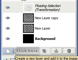
Figure 19: Click the NEW LAYER button. This is IMPORTANT for the next step.
Once you click the new layer button (indicated above), you’ll notice that a new layer titled “transformation” will appear and it looks a bit nice. At this point, the light curtain still looks a little funky, but that’s okay! We’re going to spread it out a little next so it appears a bit more believable. For our purposes, we need the perspective tool:

Figure 20: Select the perspective tool.
Just as I mentioned before, if you can’t find the perspective tool just let your mouse hover over each button until you do. Most of the icons are pretty similar between GiMP releases, so I can’t imagine you’ll have much difficulty finding it. Likewise, to use this tool, you’ll need to click once on the layer that we’re going to change–which would be the Transformation layer. You’ll see a few little boxes appear around various extremities on the layer, and all you’ll need to do is stretch them out toward the bottom. Try aiming for something like this:
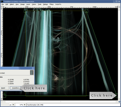
Figure 21: Click exactly ONCE on the layer scaled in the previous step then widen it at the base by clicking and dragging the square handles on the lower left and right.
I have one “click here” arrow on a corner of the transformation interface (see the little green box?) and another on the Transform button. Once you’re satisfied with the results, click the button… and:

Figure 22: Click the NEW LAYER button. This is IMPORTANT!
Click on the “new layer” button. Yep, that’s twice! Once to create the scaled layer, and once to create the skewed layer. It could be a slight nuisance, but this is how GiMP handles layer manipulation. This is good, because GiMP gives you a choice: create a new layer from what we changed or paste it into a layer below. For our purposes, we want the new layer.
A Few Final Steps
If you created a copy or two of the flame we started with, you might want to repeat everything in figures 16-21 on the other flames. Don’t forget you can click on the “eye” icon next to each layer to temporarily show or hide anything that happens to be in the way. So, before we move on, go ahead and repeat these steps on the original flame layer to add a little bit of extra color to the scene. When you’re done, you should end up with something that looks vaguely like this:
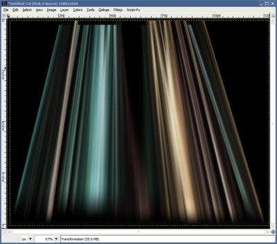
Figure 23: Almost done! We have two layers at this phase and need to move them around. Plus, we can spice up the background a little further.
It sure looks pretty, doesn’t it? I’m sure there’s a few more things we could do…
Remember the move layer button? If we wanted to shift the layers off the canvas so the sharper top edges don’t appear, we can use that tool to shift things around. But first, let’s apply a gradient to the backdrop:
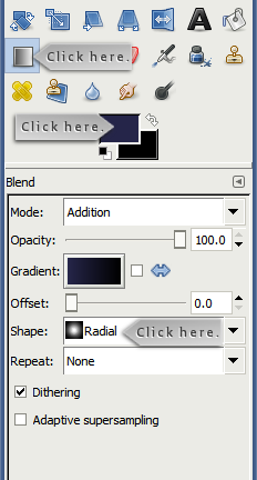
Figure 24: Click on the gradient button then change the foreground color to a dark blue. Make sure the gradient type is set to “radial.”
Click on the gradient tool (first “click here” arrow), then click on the foreground color. We’re not looking for anything terribly bright, so we’ll pick a really deep indigo. Remember what I said about blue? It’s groovy, so we’ll add more blue. It’s a great color. Once you’re satisfied with the choice of color, change the gradient type to radial (third “click here” arrow), then click toward the top edge of the canvas and drag the mouse down. You’ll wind up with something like this:
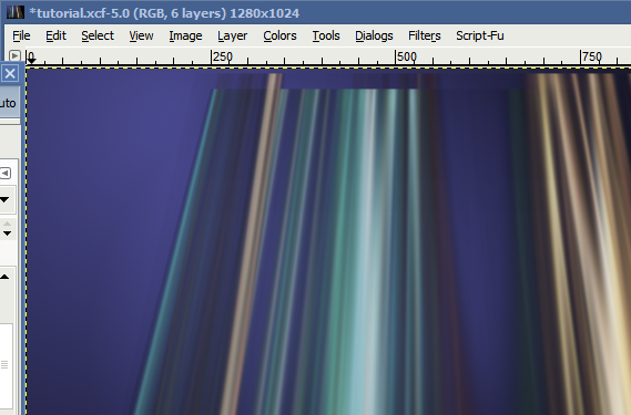
Figure 25: We’ve added the gradient to the background. It looks a little better, but the light beams don’t show up too well, do they?
It looks a bit better, but now we need to move the individual layers. So, we’ll click on the move layer button, and drag each layer upwards a little bit. But, since we have a nice blue gradient on our backdrop, we also want to do one last thing:
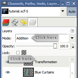
Figure 26: Select one of the light curtain/light beam layers and change the color mode to “additive.” This will brighten things up.
First, select the Transformation layer you want to apply the additive color mode to and then click the drop-down box next to “mode” (first “click here” arrow). Change this selection to “Addition” for both curtains, move them around a little more, and you should wind up with this:
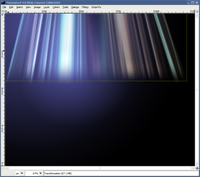
Figure 27: Finished product. Looks nice, doesn’t it?
Isn’t that something? It looks great, doesn’t take long, and can be done with free, open source software.
Pages: 1 2


Leave a comment