If you read through part of my previous tutorial on creating light curtains in GiMP, you may be stuck on getting the flame plugin to work properly. Here’s a brief article on what you’ll need to do.
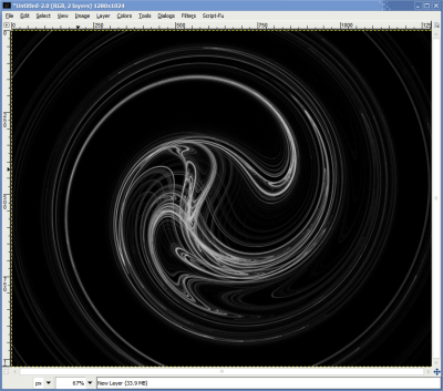
A good flame looks something like this:
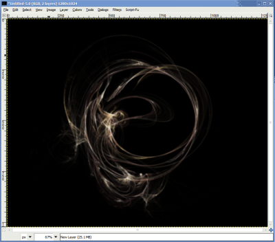
Unfortunately, getting it to look anything like the example above is sometimes an exercise in patience (and luck). If you’re reading this, chances are you’re just unlucky. Here’s what you’ll need to do.
First, open the flame dialog from right-clicking on the canvas and selecting Filters -> Render -> Nature -> Flame:

If you’re exceedingly unlucky, you’ve probably wound up with a dialog that looks like this:
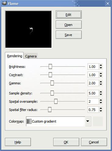
It certainly looks rather uninspiring, doesn’t it? That’s okay, because I have a solution, and you’ll need to click on Edit:

Now, you’ll have a mighty odd selection of other things that should look a little like this:
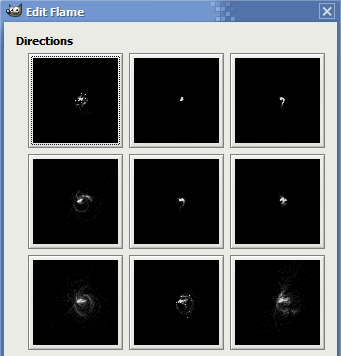
There aren’t many good choices here are there?
Don’t worry, because I have the cure!
See the randomize button in this picture?
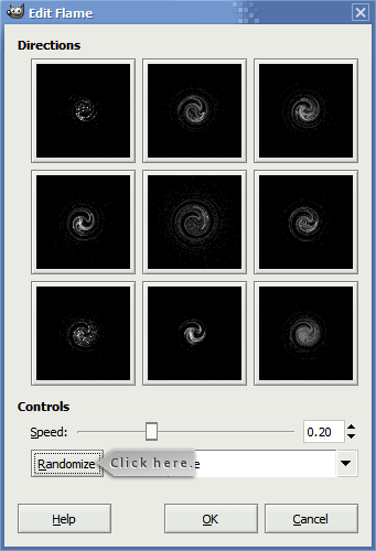
Click it. If it doesn’t work. Click it again. And again, and again. Click it until you get something that looks like a little circle. If you like the circle, click it!
Here’s a sample:
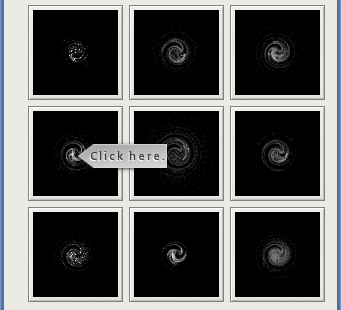
See how the one that looks a little bit more cohesive happens to be in the middle left cell? That’s the one we want. To get it, we click it. Then…
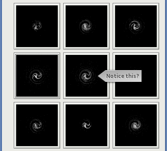
…it appears in the center-most box. We’ve got what we want after some work. Now, we’ll click OK. We’re not done yet, however!
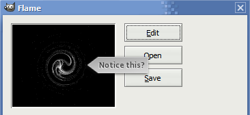
See how the flame looks a little small? We need to zoom in a bit. That’s the easy part:
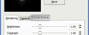
Click on the “camera” tab. Now, you’ll need to change something here:
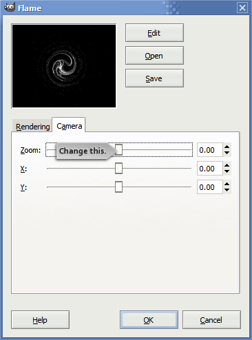
See the “zoom” slider? Increase it until you get something like this:
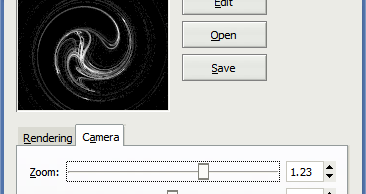
But wait! We’re not quite done yet. You do need to make some other changes. If you run the flame as it is right now (go ahead and do it, then come back to this part), you’ll wind up with a flame that’s a little pixellized and hardly looks like a finished product. Here’s what you need to change:
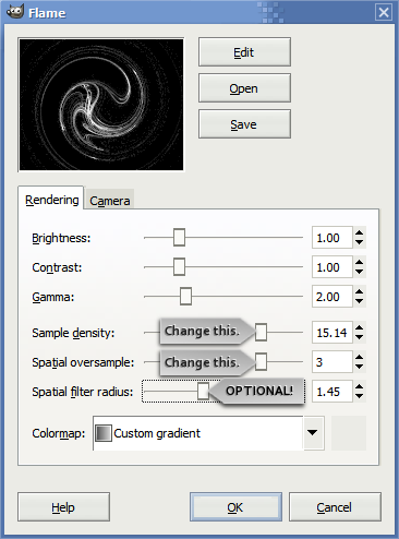
The first slider (sample density) has the greatest impact on the quality. The higher this value, the less grainy the final result. The second slider (spatial oversample) can have a similar impact. Try it by adjusting the first slider to the right; if the flame still a little too grainy, increase the second slider. The third slider can help eliminate grain but don’t increase it too much; if you do, the flame will appear really fuzzy! Although, this could be what you’re aiming for, especially if you’ve come here after reading my light curtain tutorial!
Hopefully this tutorial will give you a bit more use out of the flame plugin. When I first encounter it years ago, it seemed worthless! I recall thinking something to the effect of, how is this little handful of pixels going to do anything for me? It just needs some nursing to life!


Leave a comment